Lacey's Flash Games character art is the visual backbone of a series that players remember long after the browser tab closes. The flat, hand-drawn portraits, the washed-out palette, and the oddly blank expressions do more storytelling than any line of dialogue, and that is exactly why the artwork keeps pulling people back in.
If you have ever paused on a character screen just to study the linework, you are not alone. This breakdown covers the official portraits, the fan art and fanart scene they inspired, cosplay approaches, and how the music video visuals tie the whole aesthetic together.
What Makes Lacey's Flash Games Character Art So Distinctive
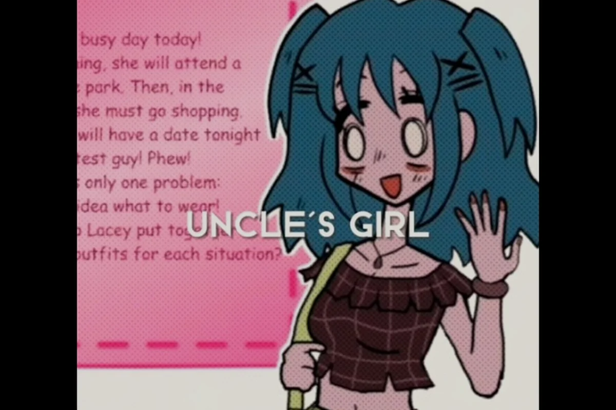
The first thing anyone notices about the character art is how deliberately plain it looks. Faces are drawn with minimal shading, eyes are simple dots or thin ovals, and the color palette leans on muted pastels that feel like a faded photograph. That restraint is the point. According to community discussion, the flat portrait style is what makes the unsettling moments land harder, because there is nothing stylized to hide behind.
The artwork also stays consistent across the entire series. Every character shares the same thick outlines and soft fill colors, which creates a unified visual identity even as the tone shifts from playful to strange. Players who dig into the full character roster often point out that this consistency is what makes the cast feel like one connected world rather than a set of unrelated minigames.
Here is how the core visual elements break down: thick, uniform black outlines keep every character portrait readable even at the small canvas sizes typical of Flash-era browser windows, while muted, low-saturation pastels produce the faded-photograph look that fans associate with Lacey's Flash Games artwork. Minimal eyes and mouths, combined with almost no shading and flat fills, leave expression deliberately open to interpretation, and sparse background shapes keep the focus squarely on the character rather than the scene.
| Visual Element | Description | Why It Matters |
|---|---|---|
| Line weight | Thick, uniform black outlines | Keeps characters readable at small sizes |
| Color palette | Muted pastels, low saturation | Creates the nostalgic, faded look |
| Facial detail | Minimal eyes and mouths | Leaves expression open to interpretation |
| Shading | Almost none, flat fills | Reinforces the 2D flash-era aesthetic |
| Backgrounds | Simple, sparse shapes | Keeps focus on the character |
That combination is why the character portraits feel simultaneously cute and slightly off. The lack of detail invites the viewer to fill in the emotion, and different players read different moods into the same face. It also explains why Lacey's Flash Games fan art varies so wildly from artist to artist: one illustrator leans into the dot-eyed innocence and draws the cast as cheerful mascots, while another pushes the same flat features toward unease, sharpening a mouth or darkening the pastel fills until a familiar portrait reads as quietly menacing. Neither interpretation is wrong, because the source art leaves that emotional gap open by design.
The Role of the Portrait Screens
Portrait screens act as the emotional anchor of each segment. Before a minigame starts, you get a still frame of the character looking directly out, and that pause is where the atmosphere builds. Community reports note that these static shots are frequently screenshotted and shared, which is a big reason the artwork spreads so easily online.
Official Artwork and Character Design Breakdown
The official artwork is sparse by design, and that scarcity is part of its charm. There are no high-resolution render packs or concept art galleries in the traditional sense, so most of what fans study comes directly from the in-game frames. Understanding the design choices helps you appreciate why the official portraits hold up so well despite their simplicity.
A few design decisions stand out when you look closely, and each one solves a specific problem the official portraits face at Flash-era resolutions. The symmetrical framing keeps the silhouette readable when a portrait is scaled down to a 60×60 dialogue box, so the rare asymmetrical pose — usually reserved for a story beat — lands with real weight. Neutral expressions work as a blank canvas for the fan art and cosplay community, who repaint the same face into dozens of moods without fighting the original. The three-or-four-tone palette traces back to the limited color ramps of the era, and simple hair shapes plus consistent eye placement mean every new character slots into the same visual grammar instantly.
-
Symmetrical framing on most portraits, which makes the rare asymmetrical pose feel significant
-
Neutral expressions that let the player project mood onto the character
-
Limited color count per character, usually three or four tones
-
Simple hair shapes that read clearly even at low resolution
-
Consistent eye placement across the cast, tying everyone to the same art style
The result is artwork that looks effortless but is actually tightly controlled. Every character fits the same visual grammar, so a new face never feels out of place. That consistency is a production decision as much as an aesthetic one: because the official portraits reuse a shared base — the same eye spacing, jaw line, and shoulder crop — the artist only has to redraw hair, costume, and a handful of accent colors for each new lacey's flash games character art entry. The payoff shows up in the fan art and cosplay pipeline, where a single template means a cosplayer can swap wigs and props between characters without relearning a new face shape, and a fan artist redrawing one portrait can slot in a different cast member by matching the same five anchor points.
Comparing the Main Cast's Visual Identities
Even within a unified style, each character has small visual cues that distinguish them, and those cues carry most of the series' storytelling weight. Lacey herself is built from soft pink and white tones with simply tied hair and a calm, level gaze, which reads as friendly but slightly distant — she is present in every scene yet never fully emotionally available. Her friends share muted blues and greens, with varied hairstyles but near-identical facial structures, so they blur together the way half-remembered classmates do in a dream. The table below summarizes how the main figures differ in presentation, based on what players observe in-game.
| Character | Dominant Color | Distinctive Trait | Overall Vibe |
|---|---|---|---|
| Lacey | Soft pink and white | Simple tied hair, calm gaze | Friendly but distant |
| The friends | Muted blues and greens | Varied hairstyles, similar faces | Interchangeable, dreamlike |
| Background figures | Desaturated neutrals | Blurred or partial detail | Unsettling, half-present |
That last row matters more than it looks. The background figures are drawn with less finish than the main cast — desaturated neutrals instead of the friends' muted blues and greens, and blurred or partial detail where Lacey gets clean pink-and-white linework — and that intentional roughness is a big part of why the series feels eerie to so many viewers. The effect is compositional rather than incidental: because the background figures lack the simple tied hair and calm, level gaze that anchor Lacey, they register as half-present presences rather than characters, closer to the indistinct faces that fill a dream than to the interchangeable-but-whole friends in the middle row.
The Fan Art and Fanart Community Around Lacey's Flash Games
Fan art is where the series really comes alive. Because the official visuals are so minimal, artists have enormous room to reinterpret the cast, and the results range from faithful redraws to full stylistic reinventions. Searching for Lacey's Flash Games fan art turns up everything from soft digital paintings to sketchy traditional pieces, and the variety is genuinely impressive.
What drives the fanart scene is the same thing that drives fan theories: ambiguity. When a character's expression is left blank, artists fill it in. Community artists frequently report that the minimal source material is actually liberating, because there is no "wrong" way to draw a face that was never fully defined.
Common approaches in the fanart community include a handful of recurring formats that have become informal traditions. Redraw challenges ask artists to recreate a single portrait in their own style, which makes it easy to compare how differently two fans interpret the same blank expression. Expression studies are the most theory-adjacent format, since giving a character a smile, a glare, or a look of dread is itself an interpretation of the story. Scene reimaginings move the cast into new environments, while color experiments push the muted palette into vivid territory and crossover pieces blend the cast with other flash-era characters.
-
Redraw challenges where artists recreate a portrait in their own style
-
Expression studies that give the blank-faced characters real emotion
-
Scene reimaginings that place the cast in new environments
-
Color experiments that push the muted palette into vivid territory
-
Crossover pieces blending the cast with other flash-era characters
The fanart scene also overlaps heavily with the theory community. Artists often hide small symbolic details in their pieces, echoing the hidden meanings and symbolism that players debate, which gives each artwork a second layer for fans to decode.
Where Fan Creations Tend to Cluster
Most fan creations focus on Lacey herself, since she is the visual anchor of the series. Her design is simple enough to be instantly recognizable but distinctive enough to be worth redrawing. The Lacey character breakdown digs into why her design resonates so strongly with the community, and it explains a lot about why she dominates the fanart feed.
Cosplay Ideas Inspired by the Character Designs
Cosplay is a natural extension of the fanart scene, and the good news is that these designs are unusually approachable. Because the characters wear simple, everyday clothing with limited color, a convincing Lacey cosplay does not require elaborate props or custom armor. The challenge is capturing the mood rather than the costume.
Here is a practical breakdown of what each element contributes: hair and outfit carry most of the visual load because the Lacey's Flash Games character art relies on flat, low-saturation shapes rather than texture, so a plain top in muted tones and a simple tied style already read as "on-model" from a distance. Makeup and expression do the narrative work instead—the pale, low-contrast face is what separates a Lacey look from a generic schoolgirl outfit, and the calm, slightly distant stare is the single detail that signals the character's melancholy tone. Setting matters last but not least: the sparse, soft-lit background mirrors the original Lacey's Flash Games artwork, where negative space and washed-out lighting do as much storytelling as the figure itself.
| Cosplay Element | What to Aim For | Difficulty |
|---|---|---|
| Hair | Simple tied style, soft color | Easy |
| Outfit | Plain top, muted tones | Easy |
| Makeup | Minimal, pale, low contrast | Moderate |
| Expression | Calm, slightly distant | Moderate |
| Setting | Sparse, soft-lit background | Moderate |
The expression is the hardest part. A blank stare that reads as "creepy" rather than "bored" takes practice, and cosplayers who nail it report that the whole look comes together instantly. Photographers who shoot in soft, slightly overexposed light get the closest match to the in-game palette.
Capturing the Flash-Era Aesthetic in Photos
The visual signature of the series is partly a product of its era, so leaning into that helps. Slightly washed-out editing, low contrast, and a hint of grain push a photo toward the flash-era look. Cosplayers who post their results often mention that a plain background does more for authenticity than any prop.
Music Video Visuals and the Jammers Song Connection
The music side of the series is inseparable from its visuals. The Lacey's Flash Games music video content pairs the same flat character art with animated sequences, and the jammers song in particular has become a fan favorite because the visuals match the upbeat energy so well. Players who want the full audio breakdown can explore the soundtrack and media overview, which covers how the music and imagery work together.
What makes the music video visuals effective is restraint. The animation does not try to be flashy; instead it uses simple movement, repeated frames, and the same muted palette as the portraits. The result feels like the characters stepped out of their still frames rather than into a completely different production.
Key visual traits in the music sequences include the same flat, thick-outlined character art used in the portrait screens, redrawn across a small handful of keyframes rather than smoothly tweened. Because each jammers song runs on a fixed beat grid, the animators time pose changes to land on downbeats, so a character's idle sway or arm pump hits exactly when the chorus kicks in. Shadows are kept as single flat fills with no gradients, matching the muted palette of the still portraits, and expressions stay in the same exaggerated range fans already know from the character art. This low-frame, high-contrast approach is what lets a four-frame loop read as intentional stylization rather than a limitation of the Flash-era toolset.
-
Looping character animations that echo the static portraits
-
Limited frame counts that preserve the hand-drawn feel
-
Color shifts that sync to the beat of the jammers song
-
Simple stage-like backgrounds that keep focus on the figures
-
Recurring poses that fans recognize from the portrait screens
That last point is why the music video and the character art feel like one continuous piece of design. The same poses show up in both, so the animation reads as an extension of the artwork rather than a separate project.
Why the Jammers Song Visuals Stick With Viewers
The jammers song sequence is memorable because it takes the blank-faced cast and gives them motion without giving them personality. They dance, they repeat, and they never quite emote, which is exactly the unsettling charm that defines the whole series. Fans who recreate these sequences in fan edits tend to keep the same looping structure, which shows how strong the original visual language is.
Practical Tips for Studying and Creating Your Own Artwork
If you want to draw, cosplay, or animate in this style, the best starting point is careful observation. The artwork looks simple, but the proportions and color choices are consistent enough that small mistakes stand out. Breaking the style into measurable parts makes it much easier to replicate.
A workable practice routine looks like this: spend the first ten minutes copying a single in-game portrait freehand, matching the thick outer contour against the thinner interior lines that define the hair spikes and shoe soles. Then block in the flat four-color palette before adding any shading, since Lacey's Flash Games character art relies on solid fills rather than gradients. Reserve the final pass for the face, checking eye size and mouth placement against the reference at arm's length so the cartoon proportions stay consistent.
-
Trace the outlines first to internalize the line weight and shape language
-
Limit yourself to four colors per character to match the palette discipline
-
Draw the face last so you do not over-detail the eyes and mouth
-
Keep backgrounds sparse and resist the urge to fill empty space
-
Compare side by side with an in-game portrait to check proportions
Community artists also recommend studying the minigame frames, since those show characters in motion and reveal how the design holds up when animated. The minigame walkthrough breakdown is useful here because it shows the character art in different contexts, which helps you understand how flexible the design really is.
Common Mistakes When Recreating the Style
The biggest mistake is adding too much detail. Shading, highlights, and complex hair strands all push the artwork away from the original look. The second most common mistake is brightening the palette; the muted tones are essential, and saturated colors instantly break the mood. Keeping things flat, pale, and simple is the whole trick.
Frequently Asked Questions
What is Lacey's Flash Games character art known for?
It is known for its flat, minimal portrait style with thick outlines, muted pastel colors, and almost no shading. That restraint creates a nostalgic but slightly unsettling mood, and it stays consistent across the entire series, which is why the cast feels like one connected visual world.
Where can I find Lacey's Flash Games fan art?
Fan art is scattered across general art communities and social platforms rather than one official gallery. Searching for the series name plus "fanart" surfaces redraws, expression studies, and scene reimaginings. Because the official designs are so minimal, artists have wide room to reinterpret the cast.
Is Lacey's Flash Games cosplay difficult to pull off?
Not at all. The characters wear simple everyday clothing in muted tones, so the costume itself is easy. The real challenge is the calm, slightly distant expression and the soft, low-contrast photography that matches the in-game palette. A plain background helps more than any prop.
How does the jammers song connect to the visuals?
The jammers song pairs upbeat audio with looping animations of the same flat characters. The animation uses limited frames, simple stage-like backgrounds, and recurring poses from the portrait screens, so the music video reads as a direct extension of the character artwork rather than a separate project.
Can I recreate this art style myself?
Yes, and the process is straightforward if you stay disciplined. Trace the outlines to learn the line weight, limit yourself to about four colors per character, draw the face last, and keep backgrounds sparse. Comparing your work side by side with an in-game portrait catches proportion errors quickly.
The artwork behind this series proves that simple does not mean forgettable. From the official portraits and their carefully limited palettes to the fan art, cosplay, and music video visuals they inspired, the whole visual identity works because it leaves space for the audience to fill in. Study the linework, respect the muted colors, and the style is yours to build on.